We're already into a new school year and with back-to-school on the brain, we're taking a quick look at a design trend that's become wildly popular with one of society's most important institutions. Thoughtful minimalism with surprises of bold colour characterize a recent wave of school design coming out of countries like Thailand, France and Germany.

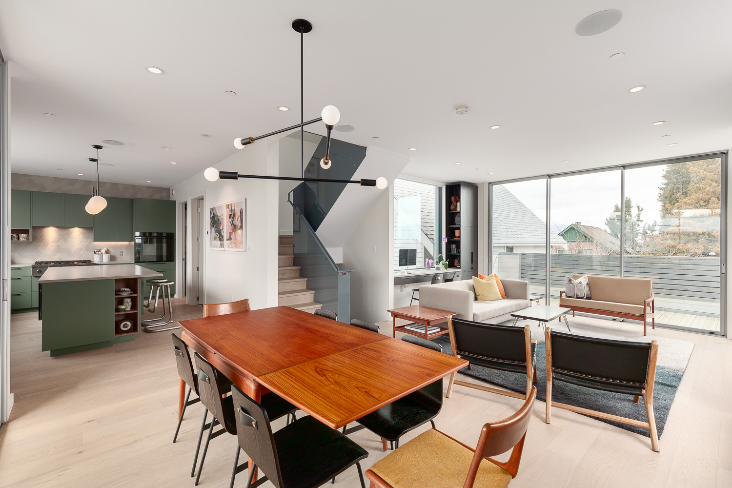
Colour blocking has fluctuated in popularity over the years. Recently we've seen its influence in many areas of design including fashion, graphics, interior design and architecture with a fresh whimsy. We often think of these professions as being very segregated, when in reality, they're interconnected by trends and disciplines at work in the design world at large.
The direct juxtaposition of austere and vibrancy creates a fun immediate contrast and visual interest.
In building design, perhaps surprisingly, it also has practical uses.


Psychology plays a big role in making sure that these are effective environments for learning, wellness and growth. The image we often have when we think of traditional school design is the oppressive massing and lifeless utilitarian interiors that were prevalent two or three decades ago. Architects and designers have jumped on the bandwagon to breathe life back into schools, redefining the image of institutionalized learning. We've seen this revitalization branch out to other areas of design as well. Decor, furniture and visual art have undergone a kind of renaissance whereby classical aesthetics and influences are re-energized - even with a touch of whimsy.


Colours have been shown to aid learning and can promote activity. Calming colours like greens, blues and purples help to facilitate quiet study. An energetic colour like red is effective in gymnasiums, where it promotes activity.


Other colours like yellow and orange are better suited for hallways because they encourage movement and make sure students don't loiter between classes. There is more than randomness going on here. Walking these halls, the colours serve as visual cues and prompts, helping with orientation. Colour-coding different floors or hallways makes navigating through a building, known as 'wayfinding', more visceral and obvious.


Fun to think of this sensory shift, especially when unexpected textures add a new dimension to the equation. Textures give schools a tactile quality that aid in learning and orientation. There's just something comfy about a fuzzy burgundy learning space.
Hard to think of these schools as stuffy institutions. We see new life and light in learning!